Overview
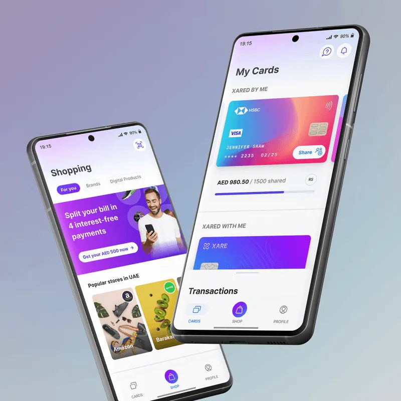
Xare is a financial platform that enables individuals to create and share debit or credit cards with their loved ones—by leveraging unused credit limits or bank access.
Most financial products are built for income earners, ignoring the 4.5 billion people who rely on them. This leaves over $25 trillion in consumer spending underserved. Xare bridges that gap by turning one person’s financial access into shared opportunity.
As the lead UX/UI designer and first design hire, I worked closely with the founders to shape the end-to-end experience—from the mobile app to the marketing website.
The work involved building intuitive flows for card creation, sharing, and usage, while designing with trust, security, and family dynamics in mind.
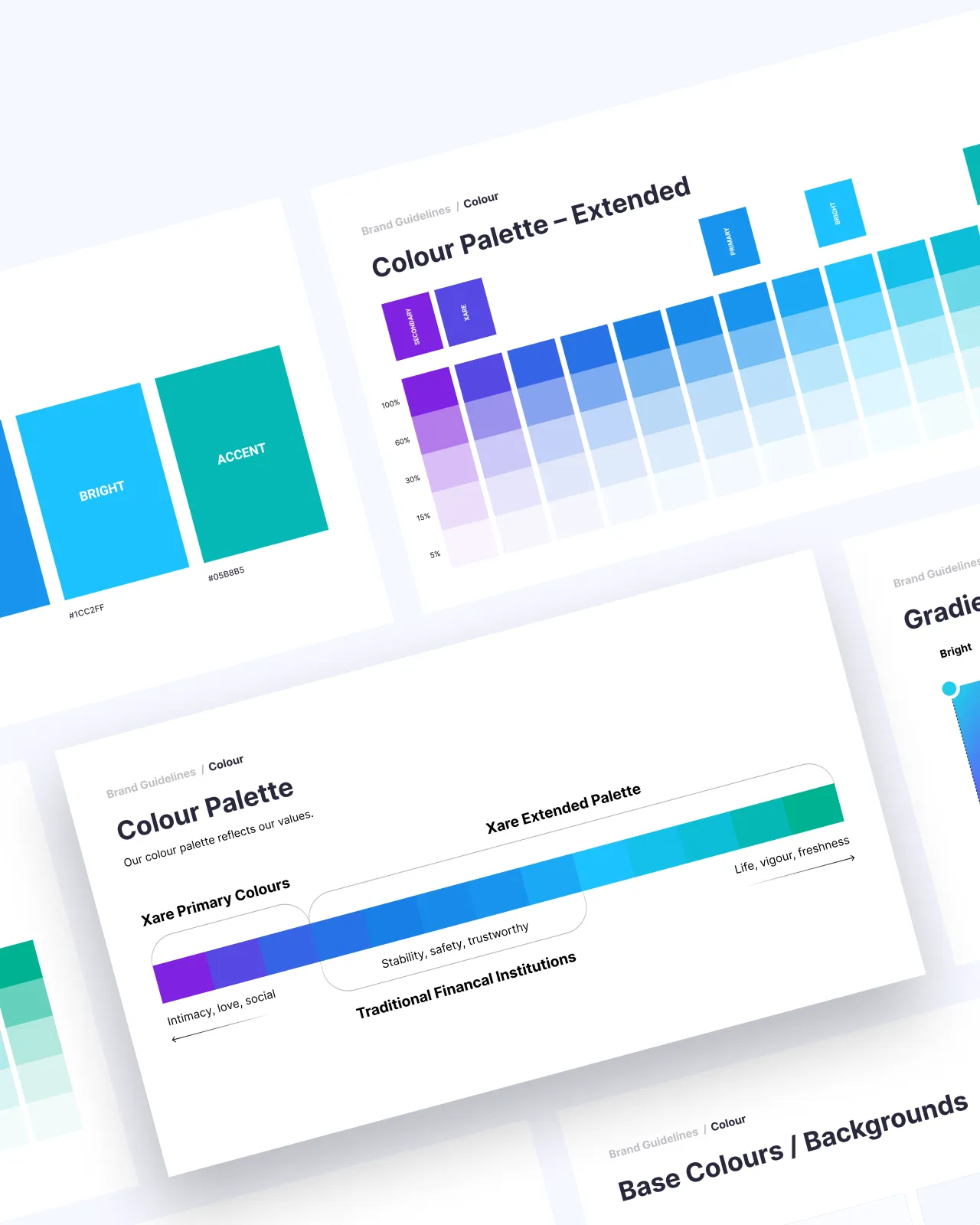
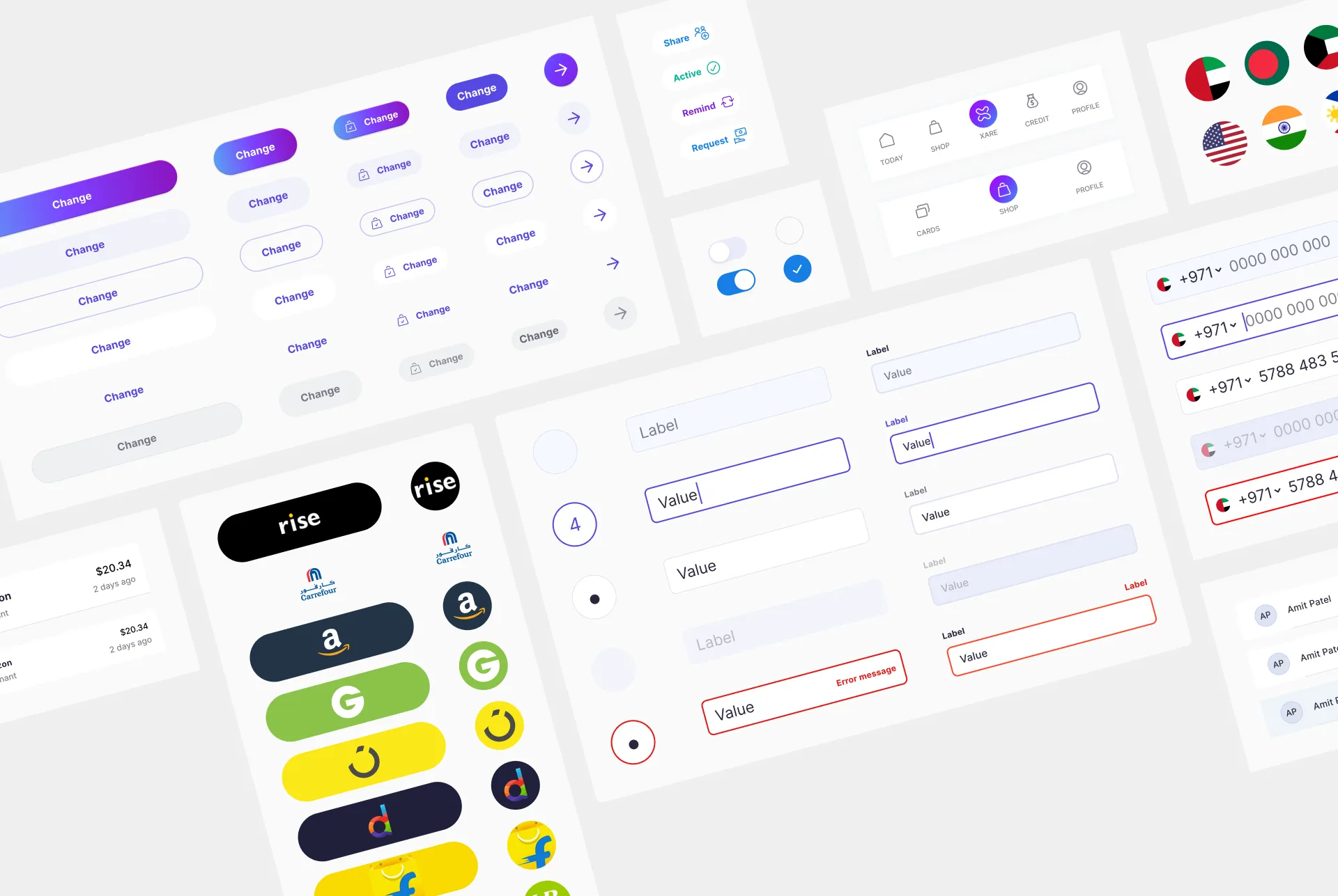
Visual System
Visual language was expanded and applied across Product, Brand, Marketing and Growth

Behind the screens
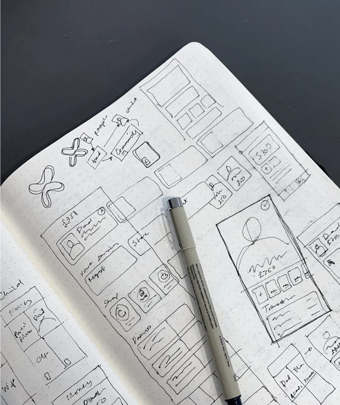
Designing Xare was an iterative process of research, prototyping, and constant refinement.
Research & Analysis
Through audits, usability testing, and journey mapping, we uncovered major friction points. The onboarding flow was disjointed and overwhelming, with little room for education or clarity. The single-screen layout limited scalability, and inconsistent visuals eroded trust. A lightweight UI kit became the foundation for a more cohesive system.
Design Explorations
Much of the process was hands-on—tweaking flows, prototyping interactions, and testing ideas. Improving the sharing flow led to strong traction, but the next challenge was encouraging users to fund their Xare cards and complete transactions.
New Insights
We restructured the app’s layout—moving from five tabs to three—to simplify navigation and group related activity. On the visual side, early consistency gave way to a need for more character and clarity across the brand.
Denouement
Sign-up completion saw a major uplift following design and UX improvements. The total amount shared on the platform grew tenfold within ten months, and the number of funded cards increased by nine times over the same period. Shopping transactions also showed a steady upward trend, reflecting growing engagement and trust in the product.
One of the clearest lessons was that nothing is set in stone—continuous testing is essential. When addressing cold start problems, it's more effective to acquire the "hard" user first. In our case, that meant focusing on the people sharing their cards rather than those receiving them. While they were more difficult to convert, they played a far more critical role in activating the network.
We also learned that best practices from Western markets don’t always translate across cultures. For example, onboarding carousels that featured illustrated characters performed poorly with Indian users. Switching to real photography or short videos of actual people led to significantly higher engagement.